GPT Image 2 提示詞大全(線上免費用):30+ 精選 prompts 涵蓋 8 大情境 2026

GPT-Image-2 最被低估的能力不是畫得漂亮,而是把字寫對。海報標題、UI 按鈕文案、包裝上的規格行,這些過去要拉回 Figma 補上的東西,現在可以直接寫在提示詞裡一次生出來。前提是你得把它當印刷發包單來寫,而不是丟一句「做一張質感海報」。
下面 30+ 組提示詞按 8 大情境分類,全部在 ChatIMG.ai 實測可用,免登入每天 5 張免費額度。所有提示詞正文都保持英文——這是刻意的:英文提示詞在版面術語與拼字準確度上的表現明顯較穩,你不需要看懂,直接複製貼上即可。
通用結構長什麼樣?
一句話:場景、文字、風格、光線、視角,依序寫滿。GPT-Image-2 對自然語言的反應很好,但它需要知道哪些字必須一字不差地出現在畫面上——這就是為什麼引號如此關鍵。沒加引號的文案,模型會當成「氛圍描述」而不是「要渲染的字串」。
[場景描述],[文字內容],[風格關鍵字],[光影描述],[相機/視角]實例:
A coffee shop window display, sign reads “OPEN 7AM - 9PM, FREE WIFI”, warm golden hour lighting, shot from sidewalk view, photorealistic
海報與平面設計要怎麼下提示詞?
把標題文字放進引號,並指定字體氣質與版面位置。這是 GPT-Image-2 最強的一塊,處理得當可以直接產出印刷等級的文字排版。
- 音樂祭海報:
A vibrant music festival poster, large bold text "SUMMER SOUND 2026" centered, dates "AUG 15-17" below, neon synthwave color palette, abstract sound waves background - 電影海報:
Movie poster for a sci-fi thriller titled "ECHO PROTOCOL", tagline "Memory is the last weapon", silhouette of a figure facing a giant glowing eye, dark teal and orange palette - 講座海報:
Conference keynote poster, title "AI for Designers 2026", speaker name "Sarah Chen" in bold, gradient background from purple to pink, minimalist Swiss style - 促銷海報:
Black Friday sale poster, "70% OFF" in massive metallic gold letters, red velvet curtain background, luxury department store aesthetic
UI Mockup 怎麼生得像真的?
把介面元件逐一列出來,包含按鈕文案、狀態列數字與分頁標籤。模型不會自己猜你的資訊架構,但你把元件清單寫清楚,它渲染出來的介面文字幾乎可以直接當簡報素材。
- iOS 應用首頁:
iPhone 17 Pro mockup showing a meditation app dashboard, dark mode, large blurred green circle "BREATHE" button, daily streak "12 days", bottom tab bar with 4 icons - 網頁著陸頁:
Modern SaaS landing page screenshot, hero headline "Generate Anything" in 72px sans-serif, subheading "AI image platform with 5 SOTA models", CTA button "Try Free", clean white background - 數據儀表板:
Analytics dashboard UI, line chart showing "MRR Growth" trending up, KPI cards "Active Users 12.4k", "Revenue $42k", dark theme with cyan accents - 登入頁:
Login screen for a banking app, "Welcome back, Alex" greeting, fingerprint icon, "Last login 2 hours ago" timestamp, soft blue gradient background
社群截圖類提示詞的關鍵是什麼?
數字要寫死。按讚數、觀看次數、留言數如果不指定,模型會隨機生出一串看起來很假的數位;寫成 “1.2M views”、“❤️ 89k” 這種具體字串,成品才有截圖的真實感。
- TikTok 影片畫面:
A TikTok video screenshot, cooking content, view count "1.2M views", "❤️ 89k", "💬 3.4k", caption "5-min pasta recipe that broke the internet", verified blue check - X/Twitter 貼文:
Twitter post screenshot from a tech CEO, profile pic generic male in glasses, text reads "We just shipped GPT-Image-2 day-one integration. ChatIMG.ai is live now.", 2.1k retweets - Instagram 限動:
Instagram Story template, friend's birthday, "HAPPY BIRTHDAY EMMA" in bouncy text, 3 polaroid photos overlapping, confetti emojis, music sticker - YouTube 縮圖:
YouTube thumbnail, big shocked face on left, large red text "I TRIED GPT-IMAGE-2 FOR 24 HOURS", contrast yellow background
商品圖與電商素材怎麼指定?
寫清楚材質、拍攝角度與包裝上的規格文字。電商主圖的成敗在於「標籤上的字有沒有寫對」,所以規格行(容量、產地、烘焙度)要跟標題一樣放進引號。
- 包裝設計:
Premium coffee bag packaging, "ETHIOPIA YIRGACHEFFE" in serif type, "Single Origin · Medium Roast · 250g", brown craft paper texture, top-down product shot - 香水瓶身:
Sleek glass perfume bottle, label reads "AURORA No.7", gold cap, sitting on marble surface with petals, studio lighting - 3C 產品盒:
Apple-style product shot of "AirPods Pro 3" packaging, white background, full feature comparison table beside box, perfect typography
地圖與資訊圖表能不能生?
可以,而且是文字渲染能力提升後最明顯受益的類別。重點是把標籤數量控制在十個以內,並要求每個標籤都必須清晰可讀,否則細小文字很容易糊掉。
- 城市捷運圖:
Tokyo subway map, "SHINJUKU STATION" labeled in center, multiple colored lines crisscrossing, English and Japanese text labels, official transit graphic style - 氣象圖:
A US weather map for tomorrow, "HEAT WAVE WARNING" banner, temperatures shown for 10 major cities, sun and cloud icons, news-broadcast graphic - 流程圖:
Flowchart with four boxes labeled "Prompt → Style → Render → Export", arrows between, clean infographic style, high contrast labels
Logo 與品牌設計要注意什麼?
品牌名放引號、字體氣質寫具體、色彩指定到色系而非形容詞。Logo 提示詞最常見的失敗是「字型太藝術導致字母變形」,先要求印刷級可讀性,再談風格。
- 科技公司 Logo:
A tech startup logo, the word "Lumen" in modern sans-serif, paired with a minimalist sun/eye geometric mark, deep blue and white - 餐廳 Logo:
A vintage diner logo, "MAIN STREET DINER" in script + bold serif, paired with a coffee cup and pie illustration, retro 1950s palette - 美妝品牌字標:
A modern wordmark for a beauty brand "VELOUR", custom serif typography with a small heart dotting the i, rose gold gradient
攝影風格怎麼寫才不空泛?
寫器材、焦段、光圈,而不是寫「很有質感」。相機參數是最有效的風格控制器——它一次帶入景深、視角與色彩傾向,比十個形容詞都準。
- 街頭攝影:
Tokyo street at night, neon signs in Japanese reading "ramen", "izakaya", reflection on wet pavement, shot on Leica Q3, 28mm, f/1.7 - 商業食物攝影:
A glass of orange juice on white marble, condensation droplets, mint leaf on top, soft side lighting, top food photography aesthetic - 人像光影:
Portrait of a woman in her 30s, soft window light from left, navy turtleneck, neutral background, shot on Hasselblad X2D, medium format depth
漫畫與分鏡類提示詞怎麼下?
每一格分開描述,對白單獨標明語言。多格漫畫最容易崩在「三格內容混成一段話」,把 panel 1/2/3 拆開寫,成功率會明顯提高。
- 漫畫封面:
A graphic novel cover titled "THE LAST ARCHIVIST", silhouette of a woman walking into a giant library, sci-fi atmosphere, cover illustration style with publisher logo - 三格漫畫:
Three-panel manga page: panel 1 "developer staring at bug", panel 2 "asks AI for help", panel 3 "code instantly fixed", speech bubbles in English - 兒童繪本:
Children's book illustration, "Once upon a time, a fox found a glowing lantern", warm watercolor style, double-page spread
還有哪些已知的瓶頸?
長文字、極小字級與特殊符號仍然是弱項。知道邊界在哪,你就不會在錯的地方浪費額度。
| 狀況 | 處理方式 |
|---|---|
| 超過 30 字的長文案 | 拆成多個文字區塊,各自標明位置 |
| 極小字級 | 在提示詞加上 “highly legible at small sizes” |
| 中英混排 | 明確寫出每段語言,例如 “English headline, Traditional Chinese subtitle” |
| QR Code/條碼 | 生成後改用向量工具替換成真正可掃描的版本 |
| 風格每輪都漂移 | 把成功那輪的提示詞原樣貼回,只換主體名詞 |
常見問題
提示詞應該寫多長?
英文 40 到 90 字是穩定區間。再長容易前後矛盾,模型不知道該聽哪一句。與其寫一篇互相打架的長文,不如先寫短版基礎提示詞,再用兩輪短句修補。
中英混寫可以嗎?
可以。品牌名與必須精確渲染的字串保留原文,說明性的約束用你最順手的語言寫。唯一鐵律是:所有要出現在畫面上的文字,一律放進引號。
文字還是渲染錯怎麼辦?
先縮短,再加要求,最後才開新的一輪只修文字。順序是:把標題砍短 → 加上 “accurate spelling, print-legible” → 開一輪只說「構圖不動,只修正文字」。不要靠堆更多裝飾詞去救。
該選哪個模型?
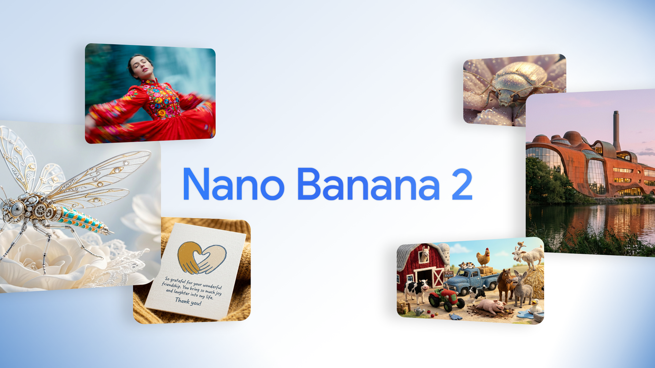
強文字排版選 GPT-Image-2;需要大量快速迭代或高解析度輸出,Nano Banana 2 更划算。不確定的話先看 7 大模型橫向實測比較,30 秒決定選型。
延伸閱讀
- 2026 AI 繪圖模型怎麼選?7 大主流模型橫向實測
- GPT Image 2 提示詞最佳實踐:先讓海報文字清楚可讀
- AI 對話式出圖工作流:從聊天提示詞到可發布素材
- GPT-Image-2 色彩提示詞庫
複製上面任何一組,貼到 ChatIMG.ai 就能出圖,每天 5 張免費、免註冊。
—— ChatIMG.ai 團隊