
Color Theory AI · Hands-onComplementary / Triadic / Analogous / Split-Complementary / Tetradic — visualised in one click
Color theory is foundational design knowledge, yet a PDF textbook is forgotten in 3 days. Color Theory AI turns each rule into interactive case studies: pick 'complementary' → AI generates 6 real-world cases (poster / web / interior / fashion) with designer annotations and counter-example anti-patterns.
Personal Color Test Playground
Recommended: switch to nano-banana-pro or gpt-image-2
Templates
Tap a card to fill the prompt — it will not generate yet
Upload a selfie or write one prompt. The model maps your season and returns a card.
Examples
Every image below was made with GPT Image 2.5. Tap “Use this prompt” to load it into the workspace above.
Why this tool
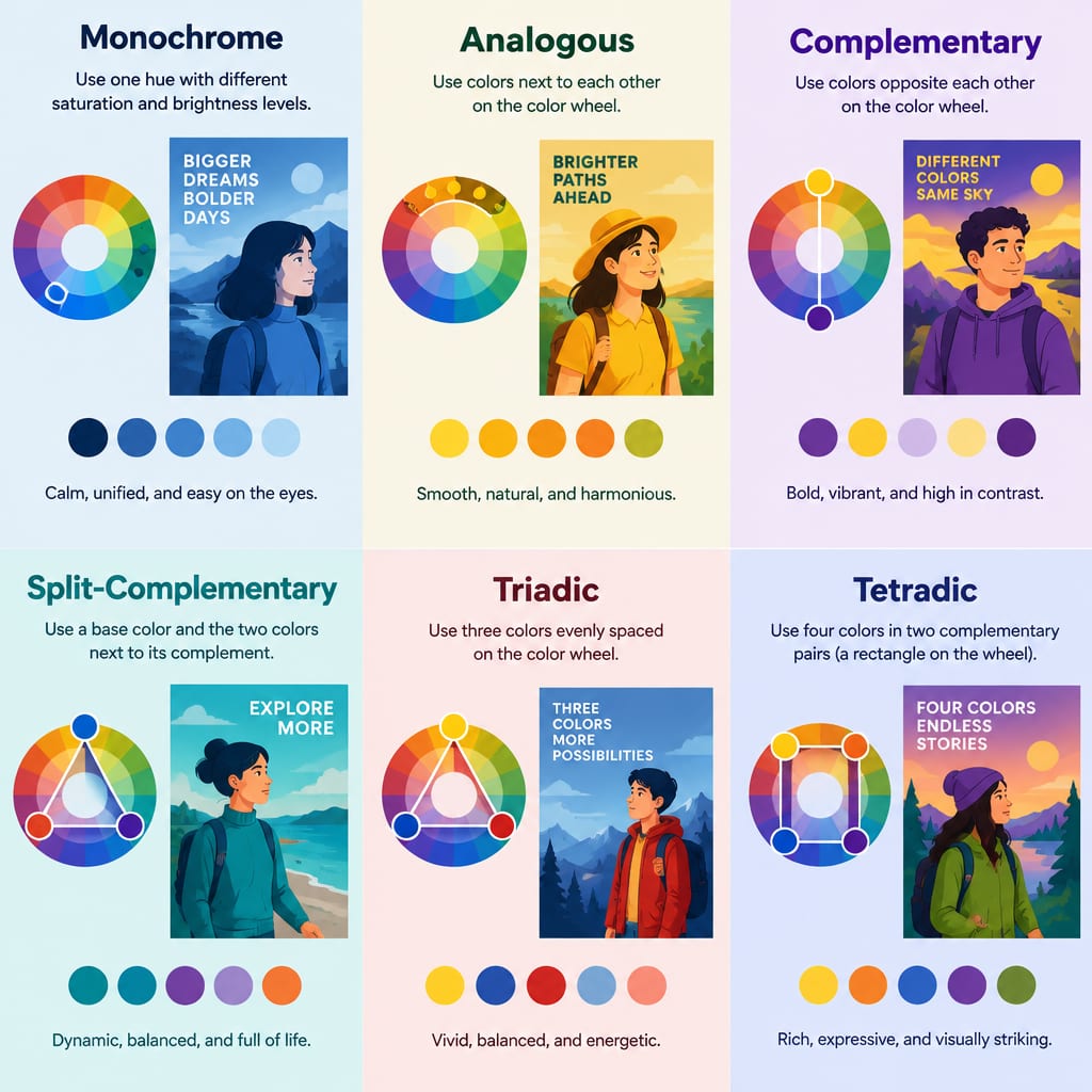
Complementary
180° opposites: red↔green / blue↔orange / yellow↔purple — max drama, hardest to balance.
Triadic
120° three-way: red/yellow/blue — classic balance, ideal for kids / festive design.
Analogous
30°-adjacent trios: orange-yellow-green / blue-purple-pink — most harmonious, hardest to mess up.
Split-Complementary
Main + 30° each side of its complement: drama softened. e.g. blue + yellow-orange + red-orange.
Tetradic
Rectangle 4-way: rich but hard to balance — needs 1 dominant + 3 support hierarchy.
60-30-10 golden ratio
Main 60%, support 30%, accent 10% — universal interior/UI rule. AI follows this ratio by default.
FAQ
Color theory / personal color / palette generator — same thing?
Different things. Color theory = objective rules (complementary etc.). Personal color = what flatters your skin. Palette generator = applied output. We provide all three as separate tools.
I’m an engineer / PM — can I learn color from this?
Yes. Each theory ships with 6 generated cases + counter-examples + designer notes — 5× faster than PDF textbooks. Suggested path: Complementary → Analogous → Triadic → Split-Comp → Tetradic → 60-30-10.
Can I apply this to code / web design?
Yes. Every case exports as Tailwind classes / CSS variables / Figma styles. Optionally call the palette generator to extend the demo palette into a full 8-color brand system.